Anatomy of a Cover
How a gorgeous book came to be
I’ve been daydreaming about possible covers for Beast Mom since I first came up with the idea for the book. This is partly because it’s a highly cinematic story; the events of the novel practically call out to be filmed, sketched, drawn, painted, or otherwise visually interpreted. But it’s also because I know that the nature and quality of a book’s cover have a huge impact on whether or not prospective readers find it—and decide to buy it.
Beast Mom will be my first self-published novel, and this is the first time I’ve participated in a cover design process from start to finish. It’s been a fascinating ride, and I thought others might like to know more about it. What follows is a rough breakdown of my process as a first-time, independent author who really, really, really wanted a killer cover for her latest book-baby.
Research
I started out with research. One of the first questions I asked was: What do books in my genre look like? This was a tricky exercise, since Beast Mom crosses multiple genres. But in general, I thought a lot about what comparative covers look like in the speculative, literary, humor, and women’s fiction genres. I studied some of the parenting and feminist titles on my bookshelves, too. With these in front of me, I considered whether they had photographic or illustrated elements, what the trending color schemes were, if they were matte or shiny, and what the fonts were like, among other things.


In Beast Mom, the protagonist Harriet “Harry” Lime turns into—spoiler alert!—a giant monster. So part of my research involved thinking a lot about all the famous precedents that that exist in the public imagination for the following: a giant female, a giant monster, an angry female, a harried mother, mutant creatures, and more. This meant that I considered everything from classic movie posters to recent animated movies to comic book superheroes and even music videos.


Harry often refers to the creature she becomes as a “big, apey-bear monster.” But we also learn that she has hyena-like teeth, horns (that may or may not change in size and shape), iridescent skin/fur, and other elements plucked from around the animal kingdom. And since there is no one existing image that captures exactly what Harry’s monster looks like, I gathered images of different animals with the various features she borrows from.


Create a brief
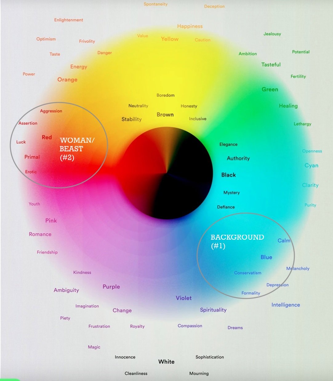
The gray circles indicate the colors I was interested in using for my cover.
Before I could reach out to potential designers and illustrators, I needed to create a design brief. (A design brief is a short document that states what you’re looking to achieve with an assignment, and compiles all the information that a creative professional will need to undertake it.) This included:
The basics (that it would be used on a book cover, the genres it should evoke, and the orientation and size of the final product)
The title and a brief synopsis of my book
Some of the inspiration images I gathered when doing research, I also included the following
The color palette I was interested in
What mood the image should convey
A statement of why that particular designer/illustrator’s portfolio appealed to me for this project
What the budget is

You never know where inspiration will come from! Illustration by Maggie Stephenson.
Contact potential illustrators/designers
I began looking for both illustrators and cover designers who met the following criteria:
They were accepting new work
They were accepting work from self-published authors (not always the case)
They had experience illustrating or designing for women’s fiction, speculative fiction, literary fiction, humor writing, parenting books, or other related genres.
They had a style/aesthetic that was consistent with my brief
Not long after I began the process of contacting designers and illustrators, I happened to glance at a beloved throw pillow in my office (see image above). I’d always loved the illustration on it, but this was the first time I noticed that the tag had a name on it—the name of the illustrator, Maggie Stephenson. I Googled Maggie and found her agent’s information, then reached out with my design brief. I was ecstatic when he replied to me and informed me that Maggie was interested in working with me. (Note: Maggie would be creating a custom illustration for the cover, but the rest of the cover design—composition, fonts, etc.—would happen later.) We agreed and signed to the terms of a contract, and got started.
Design phase
Maggie and I spoke on the phone about my brief. She asked me questions and I tried to clarify and expand on different aspects as needed. I further highlighted a few of her Instagram posts that contained pieces I particularly liked and saw as relevant to a Beast Mom cover illustration.
After this call, Maggie created and sent along a series of concepts. After considering these, I replied to her by email with what I liked. She then further developed one particular concept, and sent that back in a series of different color schemes:

The color palette in the lower left corner was an immediate winner.
I was drawn to the color palette in the lower left corner immediately. With that decision made, all that was left was to fine-tune the illustration.
My husband is a graphic designer, and he helped me articulate for Maggie what I felt needed tweaking. First, we thought the beast/woman looked a bit too masculine, so we asked Maggie to adjust her chin to be less prominent. We also thought it would be nice if the paw/hand and horns blended in with her hair a bit more; the idea being that when you first looked at the image, you’d think you were looking at a human woman, and only upon a second glance would you notice she had claws and horns (and a fang).

We sketched over a copy of Maggie’s illustration, to indicated subtle changes.
From drawing…to book cover
A designer named Gwyn Flowers took Maggie’s illustration and incorporated it into a complete cover design. It was her idea to flip the image so that the beast/woman faced to the right—and therefore toward the side that the book would open on. She came up with a few concepts that conveyed different moods and evoked different genres, largely by zooming in and out on the illustration, playing with different fonts and cases, moving the text around and changing its size and color, and more:


We played around with each of the options before committing to the one on the far right.